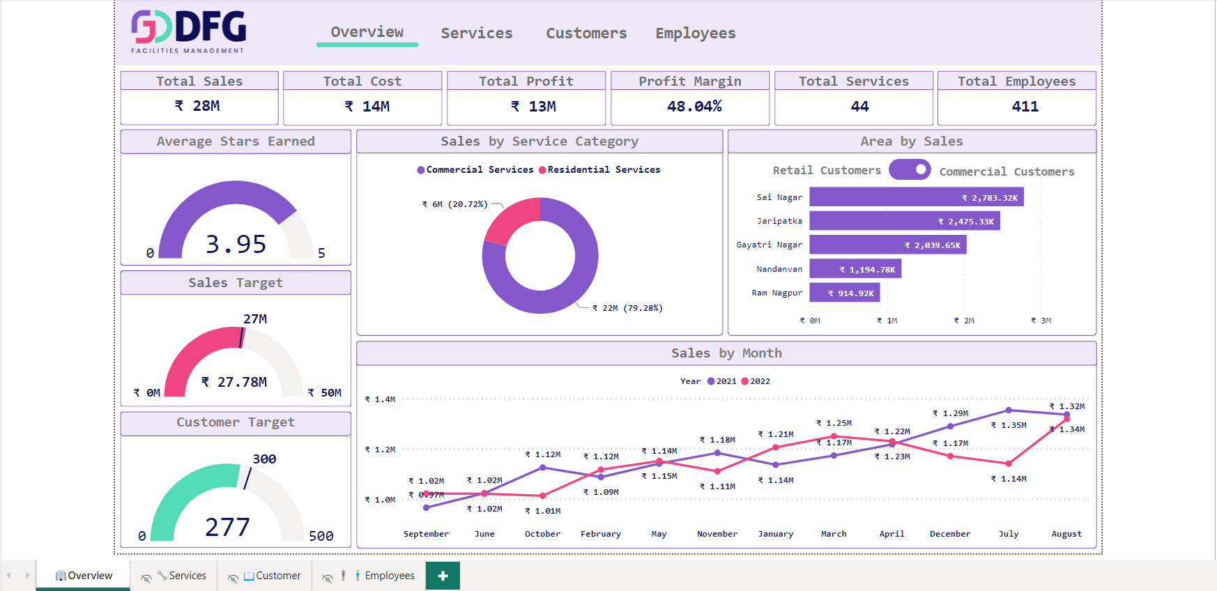
On this overview page, we have
1.1 KPIs.
Total Sales – This shows overall sales (here it is for 2 years)
Total Cost – This shows the overall cost (here it is for 2 years)
Total Profit – This shows overall profit (here it is for 2 years)
Profit Margin – This shows the profit margin in percentage over the years (here it is for 2 years)
Total Services – This shows the total number of services the company provides
Total Employees – This shows the total number of employees the company have.
1.2 Visualizations are
Tile 1: Average stars earned (Gauge Chart) – This shows the average stars earned by the employees of that company for the services
they have provided.
Tile 2: Sales Target (Gauge Chart): This chart shows the sales target they have set for the period of time and the value in the centre
shows how much they have achieved
For Eg: Here the target was 27 million for 2 years and the company has achieved 27.78 million
Tile 3: Customer Target (Gauge Chart): This shows the company have set a number of a target for customer and the number in the
middle shows how much they have achieved
For Eg: Here the target was 300 and the company has gained 277 customers
Tile 4: Sales By Service Category (Donut Chart): This shows the sales in million per category here the company has bifurcated the
services into 2 categories Commercial Services and Residential Services.
Tile 5: Area by Sales (Bar Chart): This shows the distribution of sales in a particular area by their service category. The toggle button
switches the chart from one service category to another.
Tile 6: Sales by month (Line Chart): This shows the trend of sales by month here the purple line is for 2021 and the pink is for 2022.

On this services page, we have
2.1 KPIs.
Total Services – This shows the total number of services the company provides
Total Orders – This shows the overall orders that the company got in a period of time (here it is for 2 years)
Service Profit – This shows the overall profit that the company gained against the services provided over a period of time (here it is for 2
years)
Service Sales – This shows the total sales per against the services provided over a period of time (here it is for 2 years)
2.2 Visualizations are
Tile 1: Top services by sales (Bar Chart) – This shows the maximum revenue-generating services in ascending order.
Tile 2: Sales/Profit/Cost by service type (Donut Chart): This chart shows the distribution of sales/profit/cost by services. On the left with
the help of buttons, the user can switch between the charts of sales, profit or cost
Tile 3: Overall details (Metric Table): This table shows the overall details of the particular services, details like sales, cost, profit, profit
margin, billing type

On this Customer page, we have
Here the customers are distributed between commercial and retail customers based on the services and all the visualisation can be
switched between the customer category with the toggle button on the right top
3.1 KPIs.
Total Customer – This shows the total number of customers the company have in that particular customer category
Satisfied Customers – This shows the overall satisfied customer in percentage that the company got in a period of time (here it is for 2
years)
(the customer who gave a rating of more than 3 stars were considered satisfied customers)
3.2 Visualizations are
Tile 1: Top customers by sales (Bar Chart) – This shows the maximum revenue-generating customers in ascending order.
Tile 2: Customer per area (Donut Chart): This chart shows the distribution of the count of customers by area.
Tile 3: Preferred payment type (Donut Chart): This chart shows the distribution of the count of customers by their choice of payment
type.
Tile 4: Customer Details (Metric Table): This chart shows the overall details of the customer, details like area, phone number, etc.

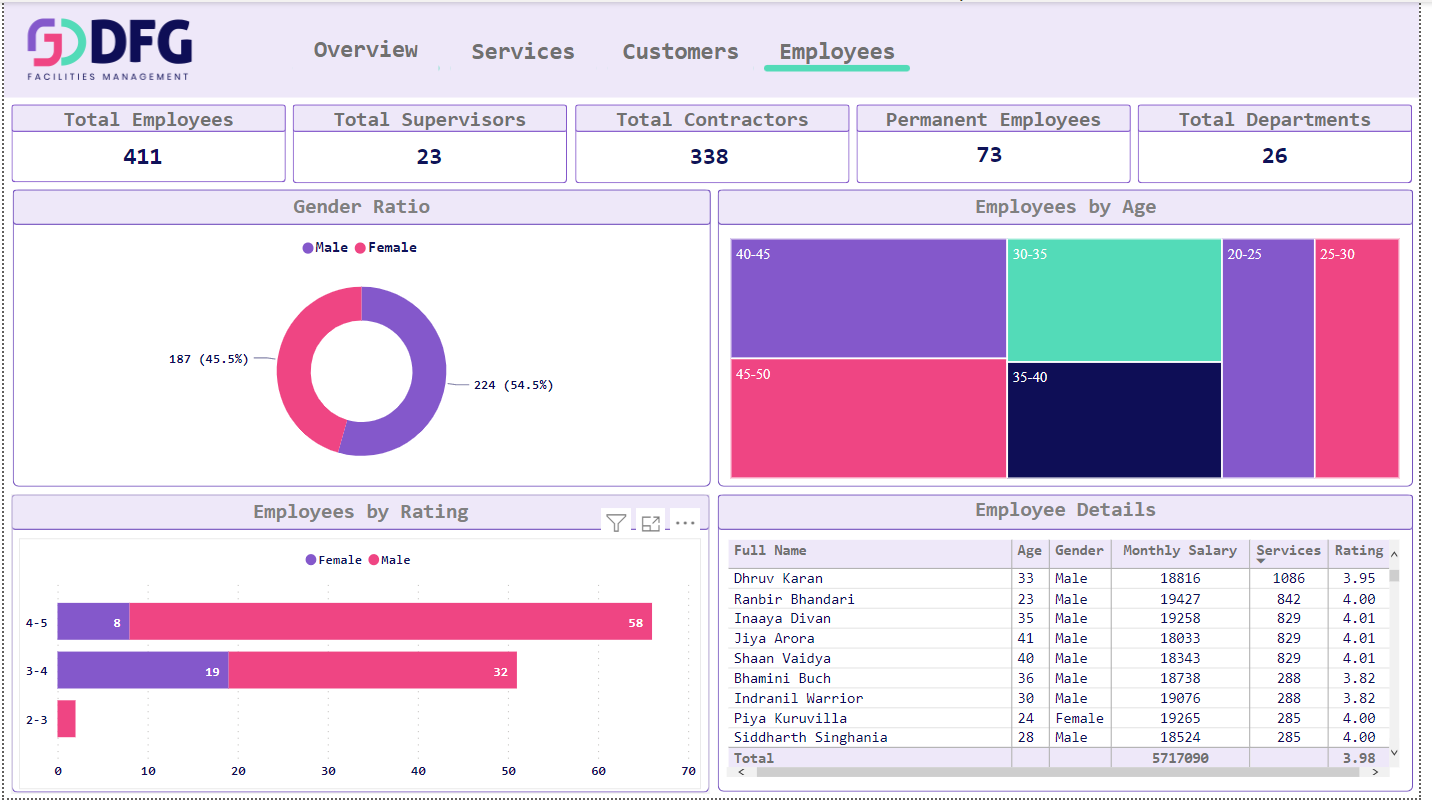
On this Employees page, we have
4.1 KPIs.
Total Employees – This shows the total number of employees the company have.
Total Supervisor – This shows the total number of supervisors the company have.
Total Contractor – This shows the total number of contractor the company have.
Permanent Employees – This shows the total number of permanent employees the company have.
Total Department – This shows the total number of department the company have.
4.2 Visualizations are
Tile 1: Gender Ratio (Donut Chart): This shows the distribution of employees by gender.
Tile 2: Employees by age (Heat Map): This chart shows the distribution of the count of customers by age.
Tile 3: Employees by Rating (Stacked Bar Chart): This chart shows the distribution of the count of employees by the rating they have
gained and the individual chart is also distributed by gender.
Tile 4: Employee Details (Metric Table): This chart shows the overall details of the employees, details like Age, Gender, Monthly Salaries,
Services, Rating, etc.
Project Details
- Category: Machine
- Client: Alex Brons
- Location: New York, USA
- Budget: $75,000
- Completed: 28 June, 2019
